


Deliverables
- Branding suite
- Logos for 10th Anniversary
- Logo for Win the Future
- Supplementary color palette
- Custom illustrations
Brief
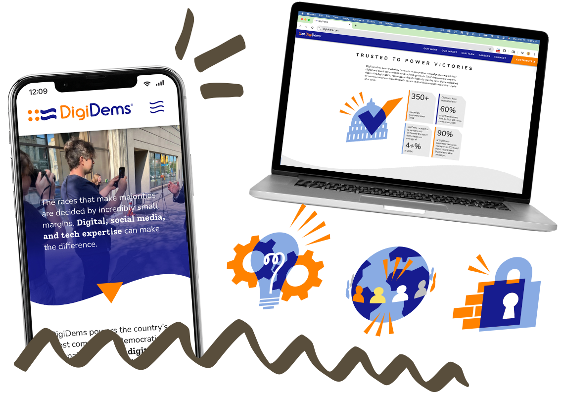
Hustle, the communications platform, celebrates its 10th anniversary in 2026. They got in touch to ask for a branding boost with special logos, brand colors, and supplementary assets like brand shapes and illustrations to carry them through the year.
Solution
My priority for this project: making something useful, that Hustle's team could use throughout the year on their website, in social media, and ads. I wanted to provide flexible assets they could upload to Canva or Google Docs and use with or without my help.
More specifically, we discussed:
- a lightweight "sub-brand" identity, complementary and additive to Hustle's existing brand (without the need for a lengthy brand guide)
- a looser, more playful style to add to the celebratory mood
- emphasizing the platform's strengths, like tech support and all-in-one tools, as well as Hustle's progressive roots
- imagery like a ballot box, checkmark, and Hustle's recognizable flag

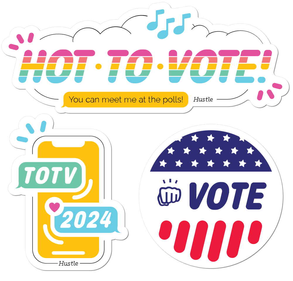
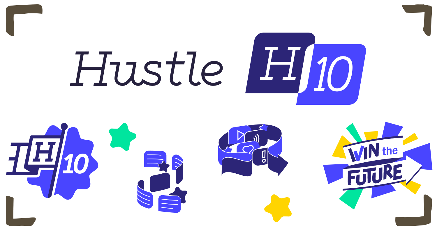
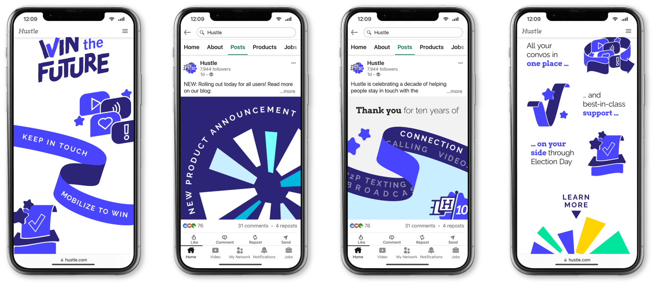
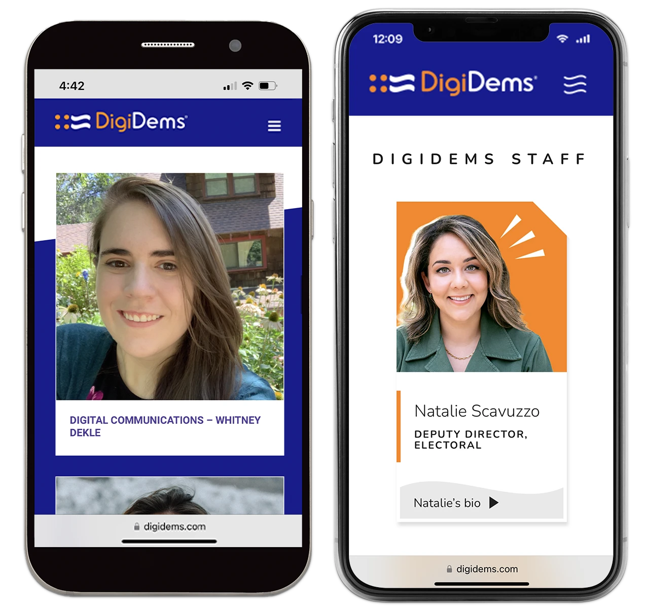
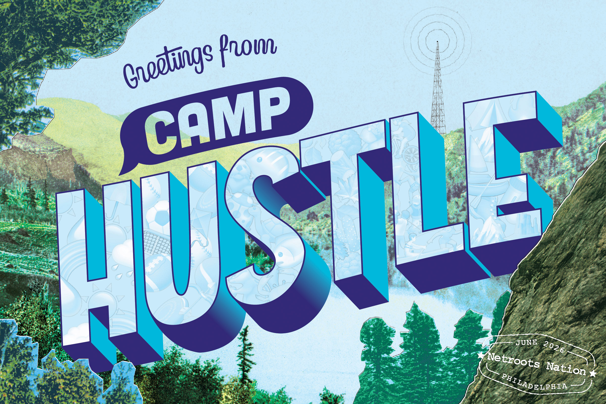
Hustle's 10th anniversary logos, including a lockup with the primary logo and a badge-size variant for email signatures.
I started with several logo concepts, quickly aligning on two variations on the "flag" theme. One used two overlapping chat bubbles to evoke a rippling flag, and is paired with the primary Hustle logo to make a lockup that can be used all year long.
The other was a specific request for a badge-size variant for email signatures. Hustle's team has long used the small flag logo as a signoff with different color schemes and variations for different holidays, so this would fit nicely into readers' expectations. The friendly 10-pointed star shape would become an additional asset useful for backgrounds, borders, and negative space.

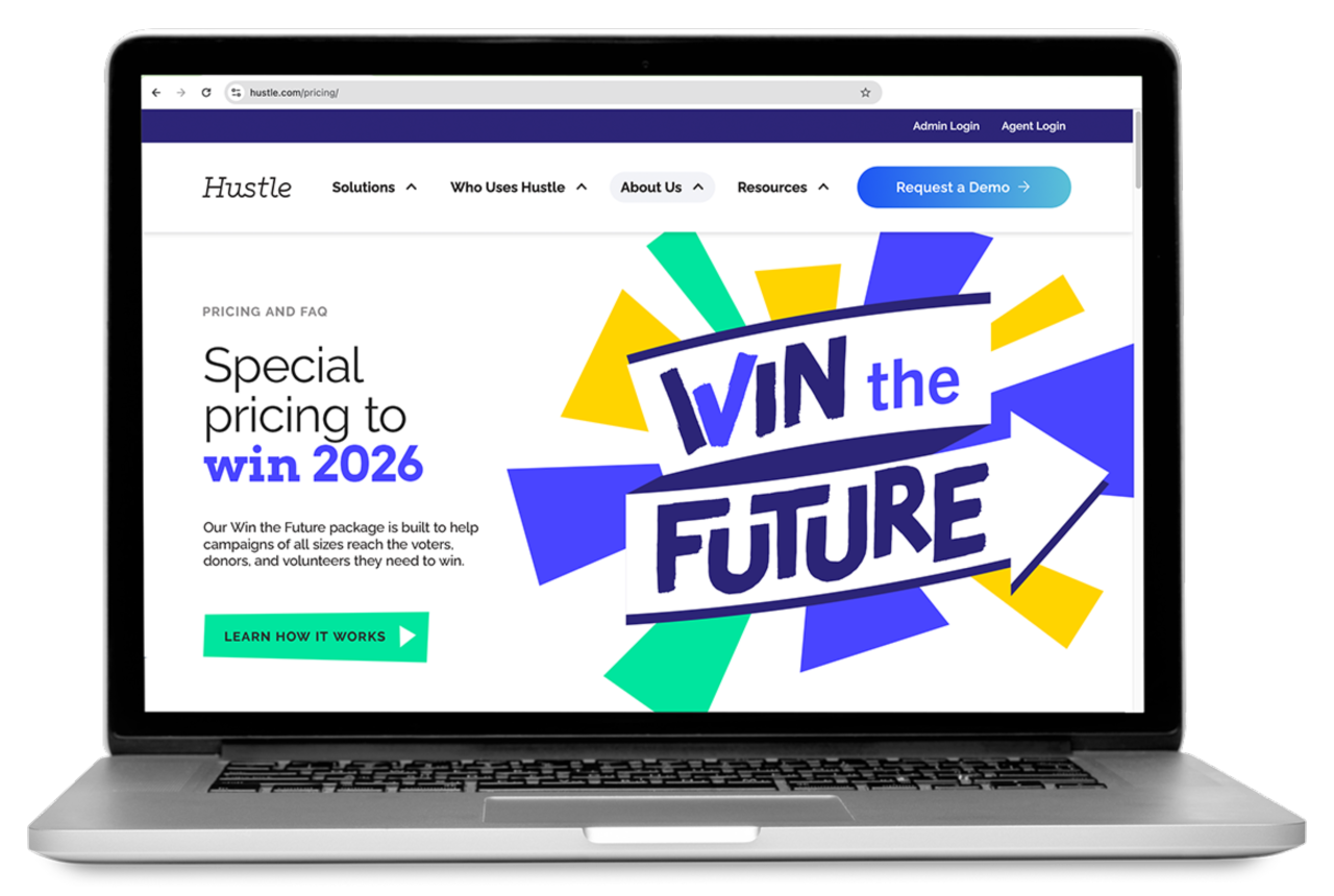
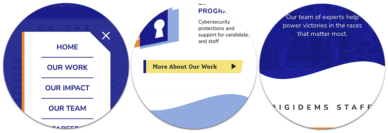
For “Win the Future” — a promotional pricing structure for political clients in a midterm election year — I first pitched two concepts, including an angular “ribbon” logo and a “sunrise” logo. We agreed the ribbon concept stood out more.

Variant Win the Future logos for different backgrounds and spaces.
The final Win the Future logo evokes progress (the upward, forward arrow), victory (the checkmark in the W), and activism (the brush font, a slightly modified Tomarik Brush). Here, too, I was able to pull out the starburst background and make it a reusable asset for year-round designs. Finally, the curved ribbon pairs nicely with the ribbon-like illustrations you'll see below.

Hustle's existing brand palette, top, and my recommended supplementary colors.
I also created an extended brand palette for this anniversary year, building on the muted, light tones of the existing Hustle brand with three brighter, bolder colors. They can play well in any combination, and particularly with the primary Hustle purple.

Recommended color proportions and gradients.
Finally, I created a handful of illustrations and brand shapes: elements that could be reused in Canva or other client-created designs, and in a style that could accommodate new illustrations as the year went on.
I started by pitching two distinct approaches:

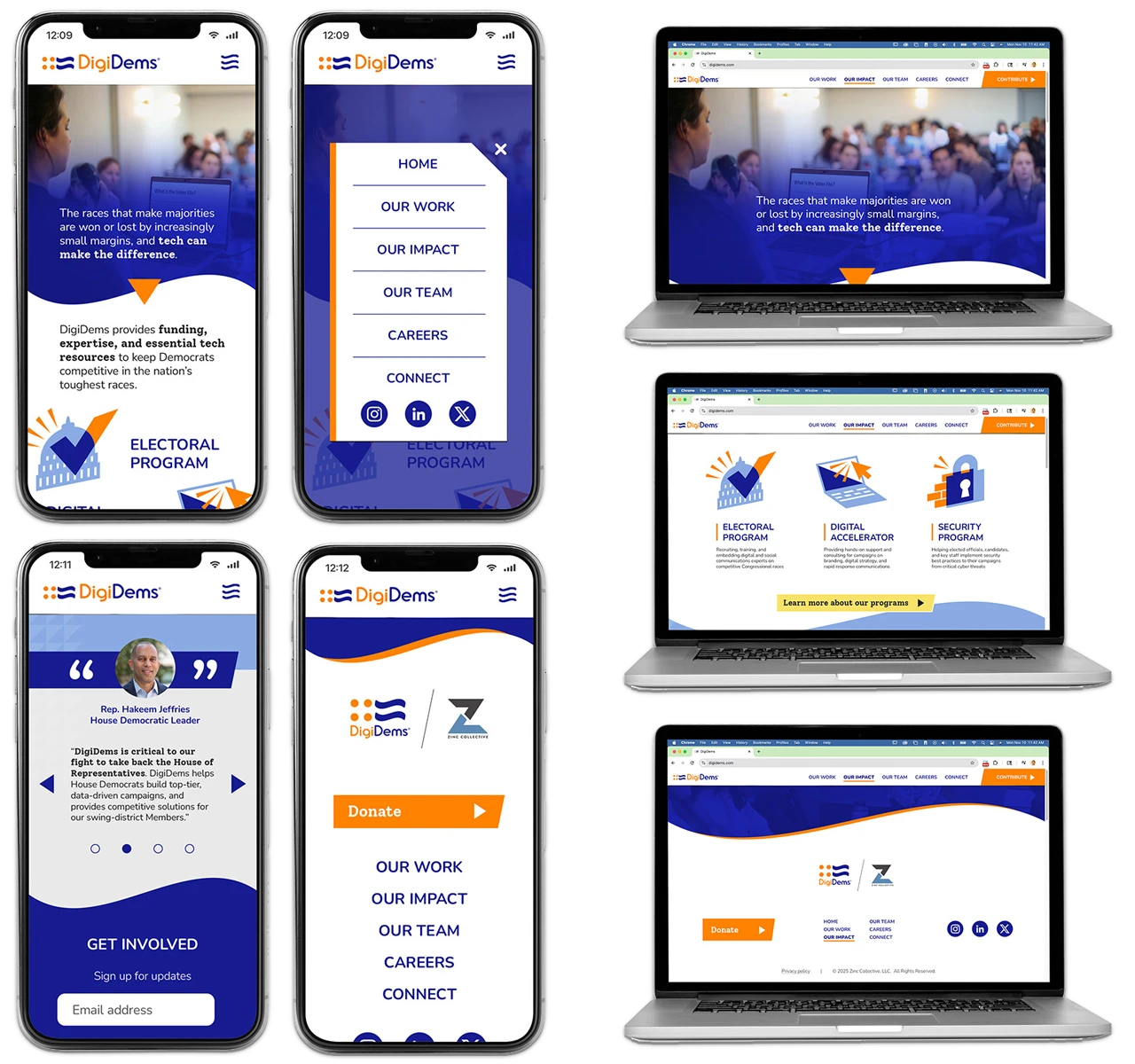
The “Stars and Stripes” set, with clean curves evoking flow, ease of use, and continuity over a decade.
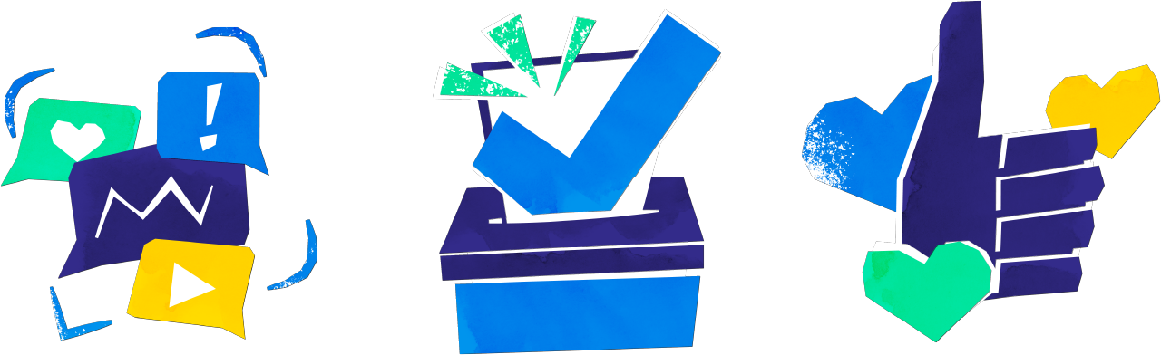
The “Collage” set, with organic, handmade shapes evoking collaboration and human creativity.
Each set highlighted different strengths of the Hustle brand. Ultimately, we decided the ribbon-like “Stars and Stripes” illustration suite would be more flexible at different scales, and built out a few additional assets, including star shapes and ribbons to act as dividers and all-purpose design elements.


![Photos of 20 people holding cards reading “I Am A [Blank] Voter” where they've written in words like First Time, Hopeful, Democratic, Health Care, and more.](/images/iaav-grid.webp)